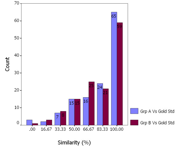
Figure 2.

Frequency analysis of evaluation similarity of Group A and B versus the gold standard for all 132 CATs. Compared to the gold standard, the blue bar indicates the number of CATs evaluated by Group A at a different similarity level; the red bar indicates the number of CATs evaluated by Group B at a different similarity level.
