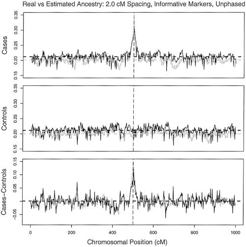
Figure 6.
Plots of average ancestry in a sample, as a function of chromosomal location. The gray lines plot the true values, and the black lines plot the estimated averages for cases (top), controls (middle), and the difference in the averages (bottom). The vertical dashed lines indicate the location of a simulated disease gene. Parameters: 800 cases, 800 controls, 200 learning samples, and 500 AIMs at a spacing of 2 cM.

