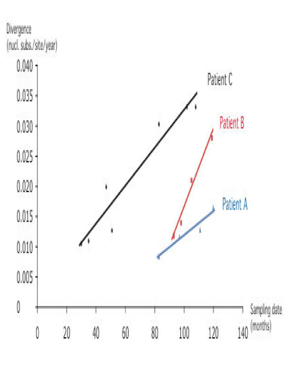
Figure 4.
Linear regression plot for root to tip divergence versus sampling date within each patient of the cohort. All regressions had an R2 value above 0.92. This graph indicates the highest slope and thus evolutionary rate for recipient B, followed by recipient C and lowest evolutionary rate for non-progressing donor A.

