
Figure 3. Allele Distributions under Environmental Fluctuations.
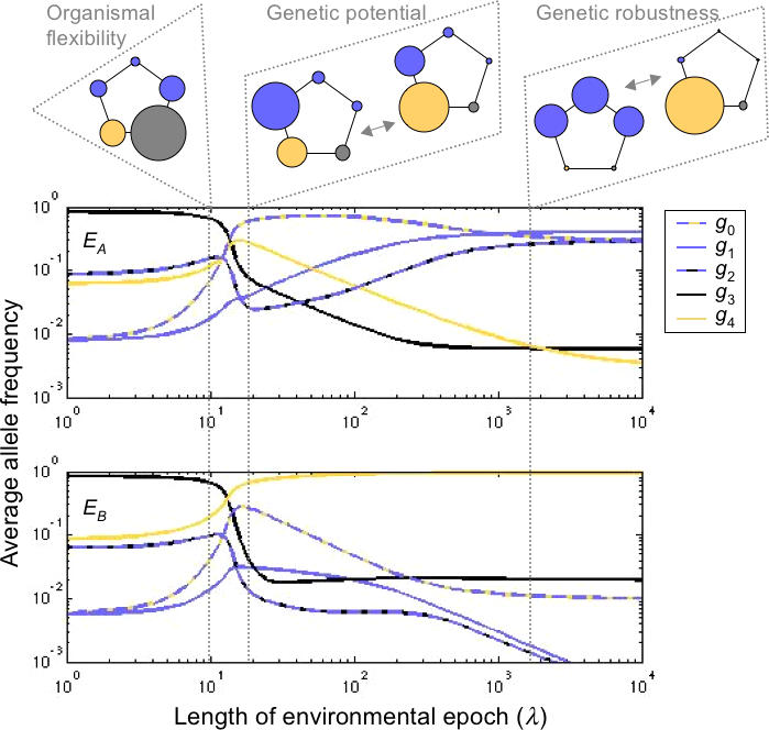
The graphs show the stationary allele distributions averaged over an EA epoch (top) and an EB epoch (bottom) as a function of the variability of the environment. As environmental variability decreases, the population moves from the intermediate phenotype to the genetic boundary between the A and B phenotypes, and eventually to an oscillation between the center of the network for A and the gene for B. Diagrams above the graphs illustrate the frequency distributions in each of the three phases. Vertex areas are proportional to the average frequencies for each allele. (For the data depicted in this figure, s = 1, k = 0.5, and μ = 0.01.)