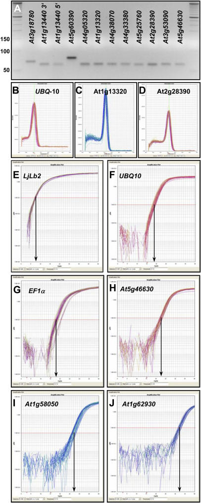
Figure 4.
Specificity and efficiency of PCR primers. A to D, Specificity of PCR amplification was confirmed by the presence of unique amplicons of the expected size following electrophoresis on agarose gels (A; compare with standard bands and Supplemental Table II), and by dissociation curves with single peaks (B–D). In each section, 54 to 60 individual melting curves are shown obtained with three technical replicates from 18 to 20 different cDNA pools. Dissociation curves and gel pictures for additional amplicons are shown in Supplemental Figures 7 and 8. E to J, Real-time qPCR amplification plots for UBQ10 (E), EF-1α gene At5g60390 (F), At5g25760 (UBC; G), At5g46630 (H), At1g58050 (I), and At1g62930 (J). Each section depicts 54 to 60 amplification curves obtained from 18 (UBQ10) or 20 different cDNA pools. The y axis of each plot shows the logarithmic fluorescence value, while the x axis represents the PCR cycle number (0–40). The gray horizontal line (red line in the online version) represents the threshold fluorescence at which the CT is determined. The slope of each plot in the linear (log) phase is used to determine amplification efficiency (E) for each reaction.

