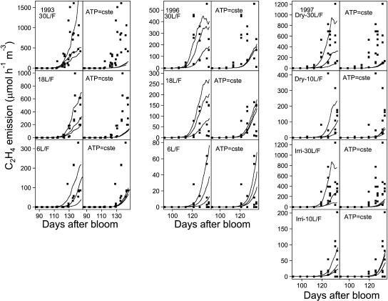
Figure 6.
Observed (points) and simulated (lines) C2H4 emission for each treatment over the 3-year experimental period. The three lines per graph originate from three simulations corresponding to the maximum, mean, and minimum masses of fruits. For each year and treatment, the case where the ATP concentration varies as a function of respiration according to the model assumption (graphs on the left for each experiment) and the case where it is constant were considered (graphs on the right).

