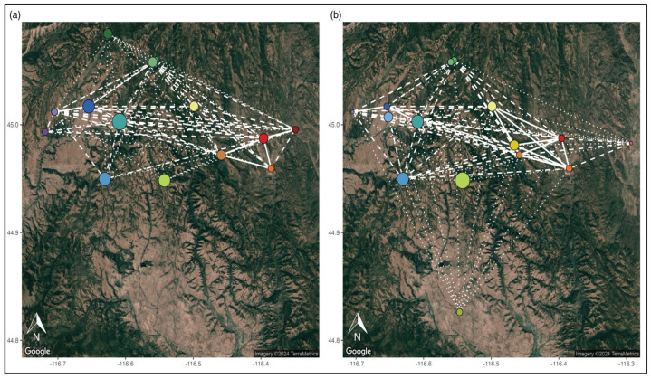
Figure 4.
Saturated spatial population graph illustrating the gene flow between NIDGS sites for (a) 2016 and (b) 2020. Edges shown are flow predictions (flow = 1 − Nei’s D): dotted = 0.85–0.90; dashed = 0.90–0.95; solid = 0.95–1.0. The sizes of the nodes are scaled to measure degree (total number of edges connected to a particular node), and the color represents sites and is the same as Figure 1 and all the PCAs.

