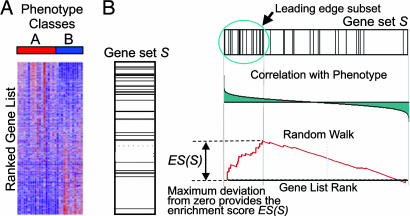
Fig. 1.
A GSEA overview illustrating the method. (A) An expression data set sorted by correlation with phenotype, the corresponding heat map, and the “gene tags,” i.e., location of genes from a set S within the sorted list. (B) Plot of the running sum for S in the data set, including the location of the maximum enrichment score (ES) and the leading-edge subset.

