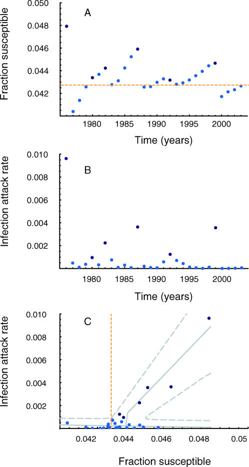
Figure 2. Observed Measles Outbreaks in the Netherlands, from 1 September 1976 to 31 August 2004.
(A) The fraction of individuals susceptible to measles on 1 September of each year.
(B) Infection attack rate of measles during each epidemic year from 1 September to 31 August.
(C) Relation between fraction of susceptible individuals and attack rate.
Dark blue markers correspond to major outbreaks; light blue markers correspond to minor outbreaks. Solid gray lines indicate the maximum likelihood values for infection attack rate; broken gray lines indicate the likelihood support region. The dotted yellow line in (A) and (C) indicates the threshold value for susceptible individuals below which solid herd immunity is achieved.

