
Figure 3.
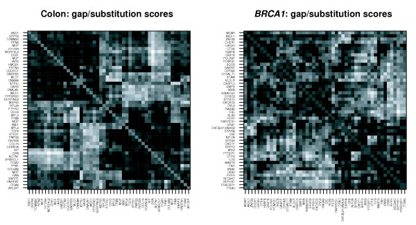
Symmetric heat map of CorScor values from Equation (1), for the colon and BRCA1 data. Columns and rows are rearranged according to a hierarchical clustering. Displayed are the 50 genes that are involved in the pairs with the highest scores. Black stands for low, grey for intermediate, and white for high score.