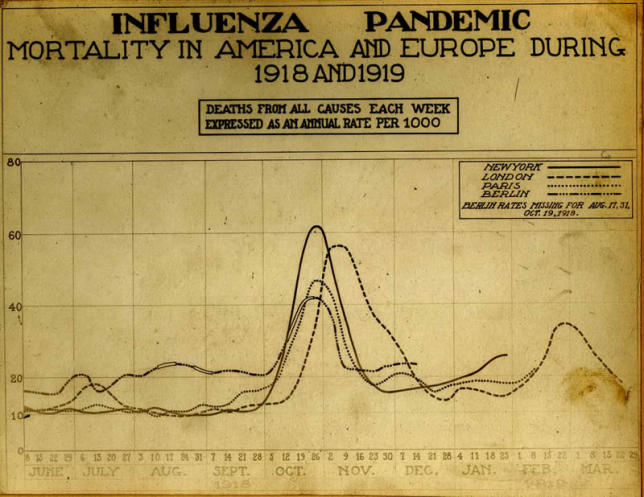
Figure 3. Historic Chart Showing Mortality Rates in America and Europe during 1918 and 1919.

(Photo: Image “Reeve 3143,” National Museum of Health and Medicine, Armed Forces Institute of Pathology, Washington, D.C.)

(Photo: Image “Reeve 3143,” National Museum of Health and Medicine, Armed Forces Institute of Pathology, Washington, D.C.)