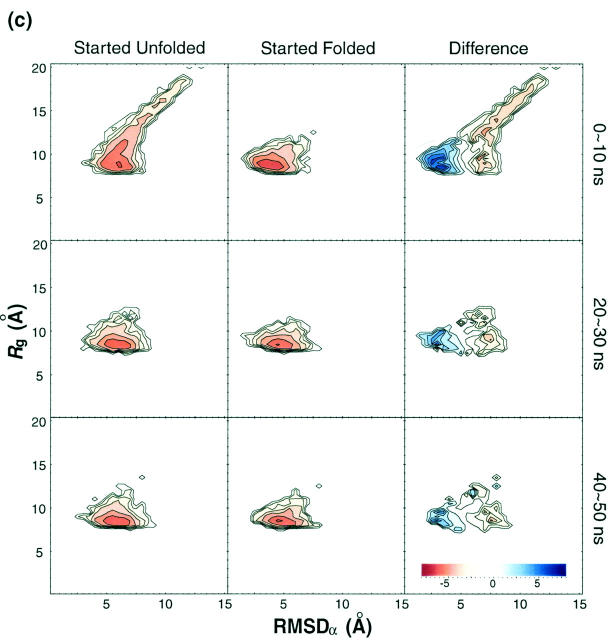
FIGURE 9.
Time evolution of free energy contour maps versus RMSDα and Rg at (a) 250 K, (b) 300 K, (c) 402 K, and (d) 500 K. From the left, each column represents the distributions obtained from the run started unfolded, the run started folded, and the difference, respectively. From the top, each row is based on configurations obtained during 0 ∼ 10-ns, 20 ∼ 30-ns, and 40 ∼ 50-ns simulation time windows, respectively. Color code is explained in the inset at the bottom. Free energy is in kBT unit.


