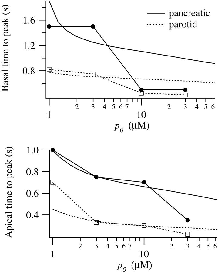
FIGURE 4.
Experimental data (symbols) and model simulations (smooth curves). The solid curves correspond to data and simulations from pancreatic cells; the dotted lines from parotid cells. The experimental method is described in detail in Giovannucci et al. (2002). (Upper panel) Time to the peak of the calcium response in the basal region, measured from the time of the IP3 release. (Lower panel) Time to peak of the calcium response in the apical region, measured from the time of the IP3 release.

