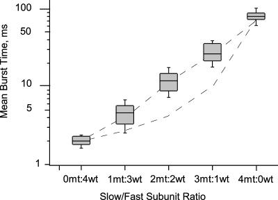
FIGURE 6.
Exponential distribution of mean burst times with increasing slow/fast subunit ratio. Mean burst time data are shown as box plots on a semilog scale. For each box plot, the central shaded box shows the middle half of the data between the 25th and 75th percentiles. The horizontal within the box indicates the median of the data. The whiskers indicate the remainder of the data. The straight dashed line represents the concerted model predictions, whereas the curved dashed lines represent the independent model predictions on the semilog plot.

