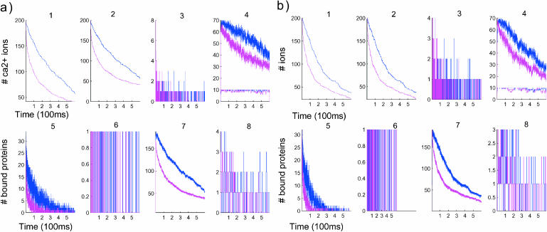
FIGURE 4.
Comparison of the time evolution for postsynaptic (a) and uniform (b) distributions of proteins. Blue curves correspond to a simulation without the push effect, whereas magenta curves correspond to simulations with it. (Panels a and b, first row) Concentration versus time (in μs). (Left to right) 1, [Ca2+] in the total spine. 2, [Ca2+] in spine head. 3, Number of ions in the neck. Note that the neck contains few ions at a time. 4, Number of bound proteins (type 1, blue; type 2, green). Note the stochastic nature of those curves. (Second row, left to right) 5, Number of saturated proteins of type 1 versus time. 6, Arrival times of ions at active pumps: the ions leave one at a time. 7, Number of bound ions versus time. 8, Number of active pumps versus time.

