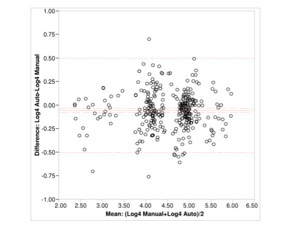
Figure 2.
Difference-mean plot shows the difference of means in log 4 scale. The four populations of data grouped across the central line represent (from left to right) the low titer control serum, the reference serum tested without compliment, the reference serum tested with complement, and the high control serum group. The y-axis is represented in log4 scale the majority of the data lying within 0.5 log.

