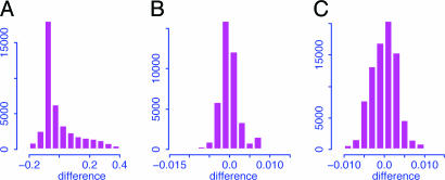
Fig. 4.
Histograms for the differences between the log ratios after and before the SLIM normalization (A), the quantile normalization for the treatment group (B), and the quantile normalization for the pooled sample (C). The pooled sample consists of both treatment and control arrays. Reduced ranges are used to get a better view of the histograms.

