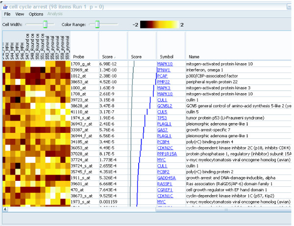
Figure 2.
A gene set details view. The controls at the top allow adjustment of the size and contrast of the heat map. The gene scores (in this case p-values) are shown in the second text column. The grey and blue graph, shown only for experiments using p-values, shows the expected (grey) and actual (blue) distribution of p-values in the gene set. This display is provided as an additional aid to evaluation of the results. The last two columns provide information about each gene. The targets of the hyperlinks are configurable by the user.

