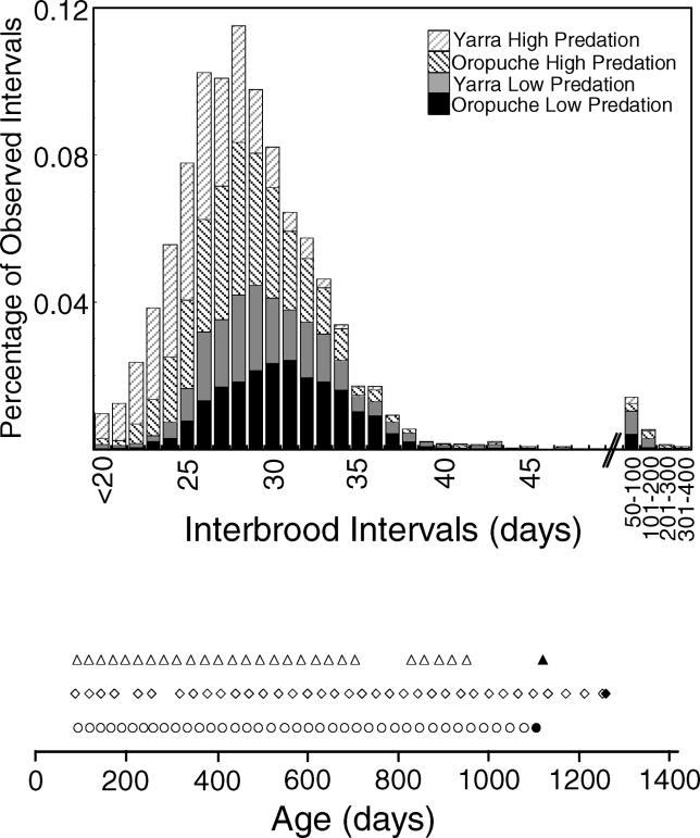
Figure 1. Interbrood Intervals.
Here we illustrate the frequency distribution of interbrood intervals for all individual intervals in the experiment. Vales are plotted for all litters less than 20 d, then per day for days 20–50. We then report the total number of litters for days 51–100, then in blocks per 100-d interval thereafter (e.g., values shown as “100” are 101–200). The bottom of the figure details the reproductive history of three individuals from the Oropuche high-predation treatment group to illustrate individual variation. Each individual's litter birth dates are represented by an open symbol on the x-axis, which represents the individuals age. The age at death is represented by a closed symbol. Details of these examples are described in the text.

