
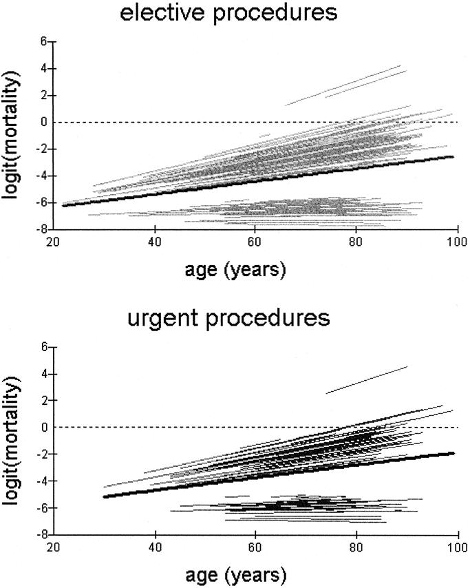
FIGURE 2. Variation of in-hospital operative mortality (plotted on the logit scale) with age across scheduled and urgent procedures. Each line represents individual prediction curves for each hospital. The median regression line (bold black) is superimposed on the prediction curves for individual hospitals.