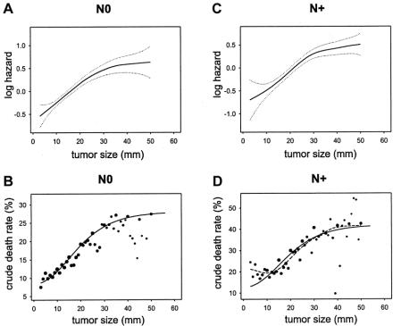
FIGURE 2. Similarity of the effect of tumor size on mortality in node-negative (N0, left graphs) and node-positive (N+, right graphs) shown by multivariate modeling (top graphs) and by crude death rates (bottom graphs). (A) Functional form of the effect of tumor size on the log-hazard of mortality based on GAM modeling in node-negative (N0) cases, with 95% confidence intervals (dotted curves). (B) Crude death rates in function of tumor size, N0 cases. Dot size represents a log10 function of the number of cases; small dots are <100 cases; larger dots represent up to 7000 cases (see Fig. 1). Plain curve: plot of the scaled function exp(–exp(–(size–15)/10)). (C) Functional form based on GAM modeling in node-positive (N+) cases. (D) Crude death rates in function of tumor size in N+. Dot size based on log10 function of the number of cases; small dots are <100 cases; larger dots represent up to 3000 cases (see Fig. 1). Plain curve: plot of the scaled function exp(–exp(–(size–15)/10)). Dashed curve: spline smoothing of the crude death rate data points.

An official website of the United States government
Here's how you know
Official websites use .gov
A
.gov website belongs to an official
government organization in the United States.
Secure .gov websites use HTTPS
A lock (
) or https:// means you've safely
connected to the .gov website. Share sensitive
information only on official, secure websites.
