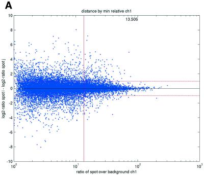
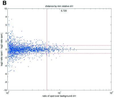
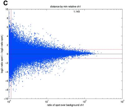
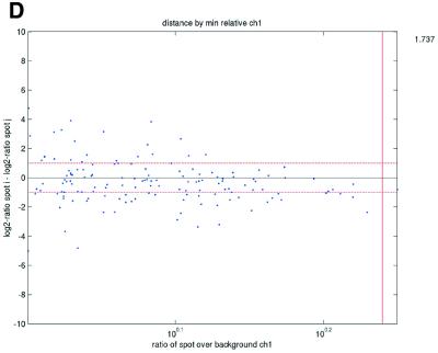
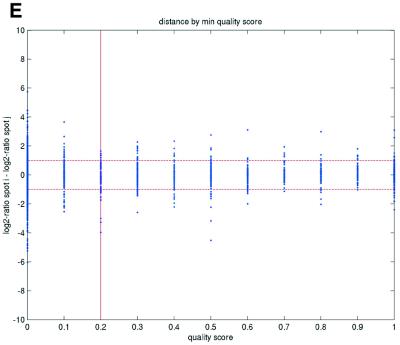
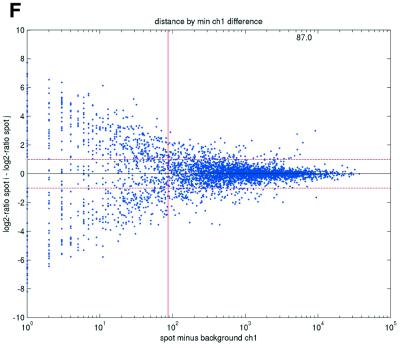
Figure 2.
(Opposite) Spot-pair differences versus quality index. For each distinct pair of spots containing the same clone, the difference of log base 2 transformed gene expression ratio in the two spots was calculated. A quality index was calculated for each spot and the minimum over two spots in a pair was used to represent the pair. The plots show all pair differences versus (minimum) quality pooled over all arrays from each data set. For the ScanAlyze data sets mopo (A), mopo-clin (B), lymphoma (C) and NCI60 (D) we show the differences plotted versus the SB ratio calculated from channel 1 for each spot. For the prostate (E) data set, the spot quality index was provided by the authors. For the DNR (F) data set we show the differences plotted versus the SB difference calculated from channel 1 for each spot. Data for channel 2 are not shown, as the data are comparable with the respective channel 1 plots. Note that the x-axes are not on the same scale. The horizontal dashed lines are at –1 and 1, showing the limits for 2-fold difference in expression ratios between two spots in the same pair. The vertical lines are placed at the x-value which would result in 95% of the differences lying between –1 and 1 if used as a filtering criterion (by removing all data points to the left). Note that the NCI60 dataset had very few repeatedly spotted clones and that the quality index provided with the Prostate dataset only had discrete values with steps of 0.1 in the range 0–1.

