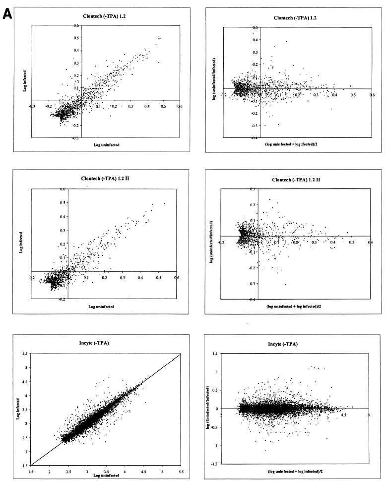
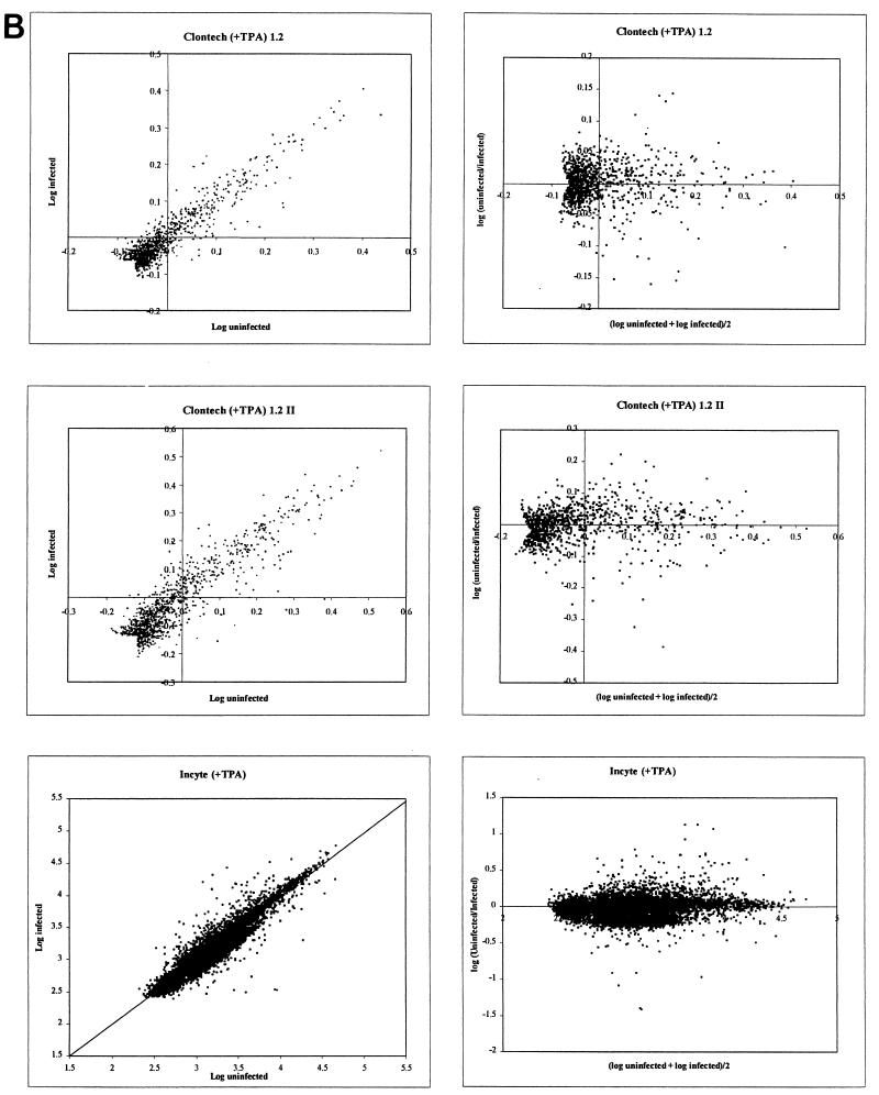
FIG. 4.
Graphical scatter plot representation of gene array data from both the Clontech and Incyte experiments. (A) Results from comparison of IDV for infected and uninfected DMVEC RNA in the absence of TPA. (B) Results from comparison of infected and uninfected DMVEC RNA in the presence of TPA. In each case, the right-hand panels show a horizontal representation of the same data given in the left-hand panels to facilitate the identification of significantly regulated genes. The x axis represents the mean log intensity (i.e., more abundantly expressed genes are to the right), and the y axis represents the log ratio of the compared samples (i.e., upregulated genes have positive y-axis values, and downregulated genes have negative y-axis values).


