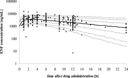
FIG. 3.
Concentration-time profiles generated from the population PK model by simulating 1,000 individuals. The dashed lines from bottom to top represent the 5%, 10%, 25%, 75%, 90%, and 95% quantiles of the population. The thick line corresponds to the predicted median concentration-time profile. Observed concentrations are shown as filled circles.

