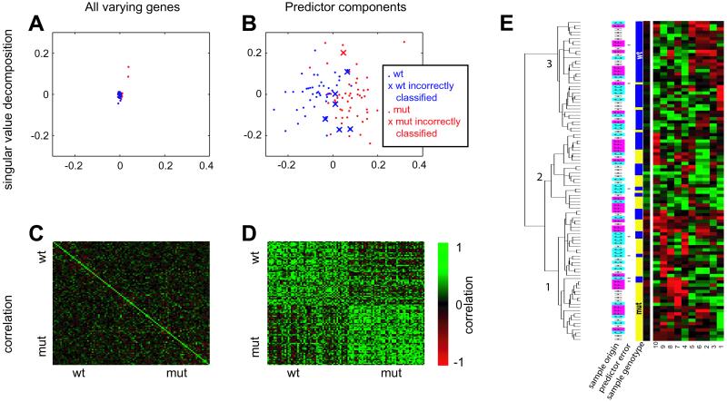
Fig. 1.
Optimal predictor. A 10-feature, 6-nearest neighbor predictor was trained on the hippocampus data and was 93% accurate in classifying the entire 100-sample dataset. (A and B) Singular value decomposition (performed by using matlab svd function) of the variation-filtered data which was the input to the predictor training (A) (n = 95, see Materials and Methods for definition) and the components of optimal predictor (B). The first two principal components are shown (PC1 on x axis, PC2 on y axis), and the scale is the same. Samples that were misclassified by the optimal predictor are depicted as Xs. (C and D) The correlation matrix of the same sets of genes. High correlation is denoted by bright green. (E) A 10-feature, 6-nearest neighbor predictor was trained on the hippocampus data and was 93% accurate in classifying the entire 100-sample dataset. The 10 features (from nine Unigene clusters) comprising the predictor are shown with the columns corresponding to the numbered genes in Table 2, and with the expression of the individual experiments represented as rows. The yellow/blue bars represent mutant and wild-type samples, respectively. The cyan/magenta/white bars represent the cerebral cortex (C), whole forebrain (F), and hippocampus (H) samples. Asterisks denote samples incorrectly classified by the predictor. The data were clustered and visualized with the cluster and treeview programs (36). Black represents the median, red represents expression higher than the median (saturated at two interquartile ranges), and green represents expression lower than the median (saturated at two interquartile ranges).

