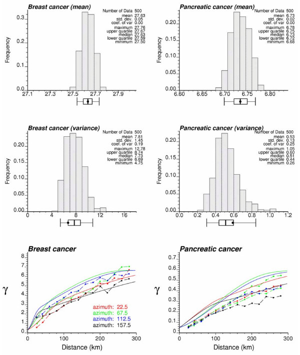
Figure 11.
Reproduction of target statistics by the set of simulated risk maps. The top and middle graphs show the histograms of the mean and a priori variance of each set of simulated values. The black dot in the box plot below each histogram is the target value identified as the average estimated risk or the sill of the risk semivariogram model. Five vertical lines are the 0.025 quantile, lower quartile, median, upper quartile, and 0.975 quantile of the distribution. Bottom graphs show the directional semivariograms of simulated risk values, averaged over all 500 realizations; the solid line depicts the target model fitted in Figure 5.

