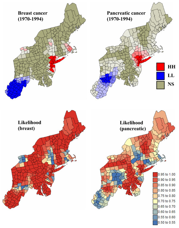
Figure 13.
Summary of local cluster analyses conducted on 500 simulated risk maps. For the top maps, the fill color in each county represents the most frequent classification observed over 500 simulations of the spatial distribution of breast and pancreatic cancer mortality risks: low-low (LL) or high-high (HH) clusters, while light gray indicates counties that have mostly been found non-significant at an α level of 0.05; the p-values were corrected for multiple testing using the Simes adjustment. The intensity of the shading increases as the classification becomes more certain; the classification likelihood is mapped in the bottom maps.

