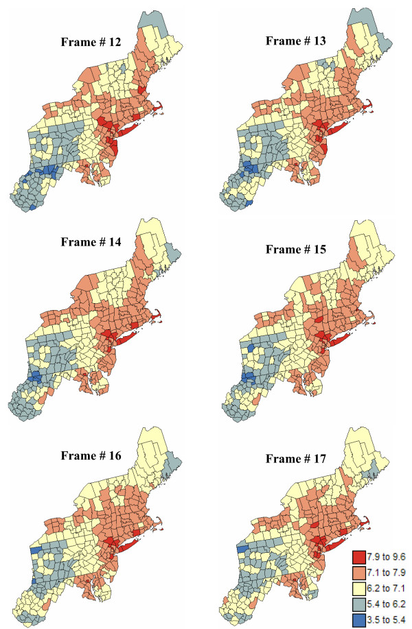
Figure 17.
Six consecutive frames of the animated display of mortality risk maps for pancreatic cancer. The fill color in each county represents the pancreatic cancer mortality risk per 100,000 person-years simulated for the period 1970–1994; fewer class boundaries are selected to enhance the spatial features in all maps.

