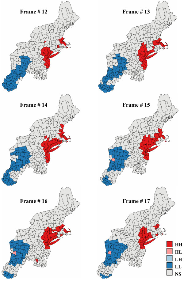
Figure 18.
Six consecutive frames of the animated display of local cluster analysis results for pancreatic cancer. The fill color in each county represents the classification into significant low-low (LL) or high-high (HH) clusters, as well as high-low (HL) or low-high (LH) outliers. Light gray indicates counties that are not significant at the level α = 0.05; the p-values were corrected for multiple testing using the Simes adjustment. The six maps are obtained by performing a local cluster analysis of the six maps of simulated pancreatic cancer mortality risks displayed in Figure 17.

