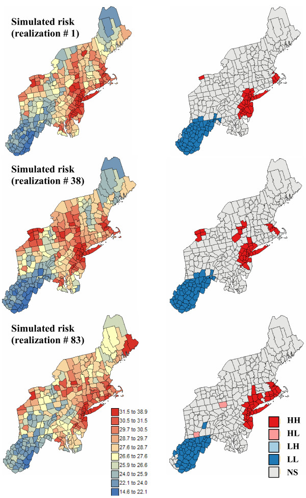
Figure 9.
Simulated risk maps for breast cancer, and results of the local cluster analysis. For the risk maps (left column), the fill color in each county represents the breast cancer mortality risk per 100,000 person-years simulated for the period 1970–1994; the class boundaries correspond to the deciles of the histogram of rates. For the local cluster analysis (right maps), the fill color in each county represents the classification into significant low-low (LL) or high-high (HH) clusters, as well as high-low (HL) or low-high (LH) outliers. Light gray indicates counties that are not significant at the level α = 0.05; the p-values were corrected for multiple testing using the Simes adjustment.

