
Figure 2.
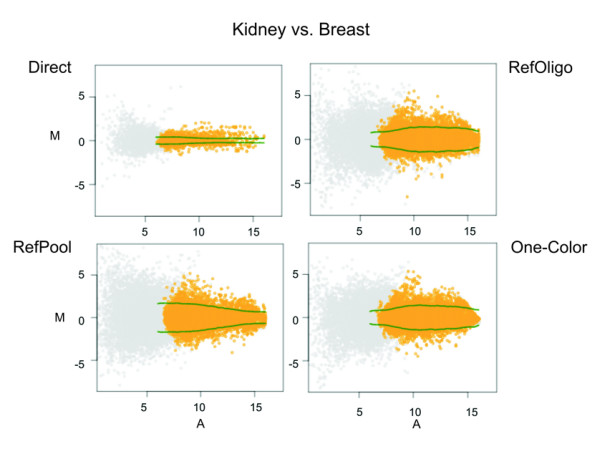
MA–scatterplots for direct and reconstructed ratios. Normalized intensity ratios for Kidney vs. Breast comparison from all technical replicates is shown. The yellow dots display the log2 intensity ratio (M) as a function of the log2 intensity product (A) for each gene on the array. Spots that were excluded from further analyses (with intensities below the local background plus 2 SD) are shown in gray. Green lines show the credibility interval thresholds (see Methods) used for estimation of differentially expressed genes.