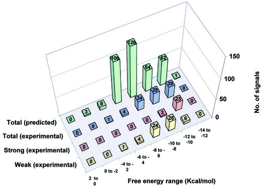
Figure 6.
Distribution of predicted versus experimentally detected hybridization signals in region B of all test species grouped according to calculated binding energy. The data were divided into groups at increments of 2 kcal/mol ΔG° value. For each incremental ΔG° group the green columns represent the total number of predicted cases in which any of the probes can form a matched or mismatched duplex anywhere within all the PCR target sequences. The blue columns show the number of hybridization signals experimentally detected for probes predicted to bind, within each ΔG° increment. The red columns represent the number of experimentally detected strong hybridization signals (average pixel intensity 10 000–50 000) in each ΔG° increment, while the yellow columns represent the number of experimentally detected weak hybridization signals (average pixel intensity <10 000) in each ΔG° increment.

