
Figure 4.
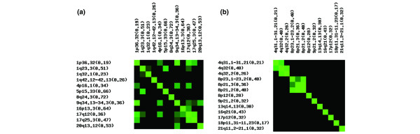
Correlations between gained and lost loci in breast cancer. Correlation matrices depicting the interaction between the most frequently gained (a) and lost (b) loci in our dataset. Black indicates a p-value > 0.05, whereas the green color becomes more intense as the p-value decreases. Cytoband location is indicated, along with the frequency of aberration in parentheses.