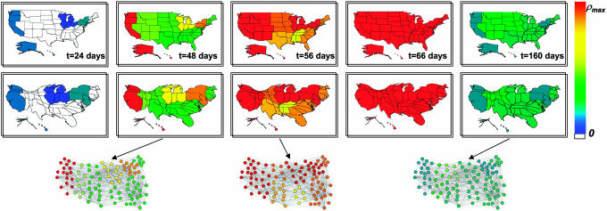
Fig. 2.
Geographical representation of the disease evolution in the United States for an epidemics starting in Hong Kong based on a SIR dynamics within each city. States are collected according to the nine influenza surveillance regions. The color code corresponds to the prevalence in each region, from 0to the maximum value reached (ρmax). In the top row, the original United States maps are shown, and in the bottom are provided the corresponding cartograms obtained by rescaling each region according to its population. Three representations of the airport network restricted to the United States are also shown, in correspondence to the three different snapshots. The nodes represent the 100airports in the United States with highest traffic T; the color is assigned in accordance to the color code adopted for the maps.

