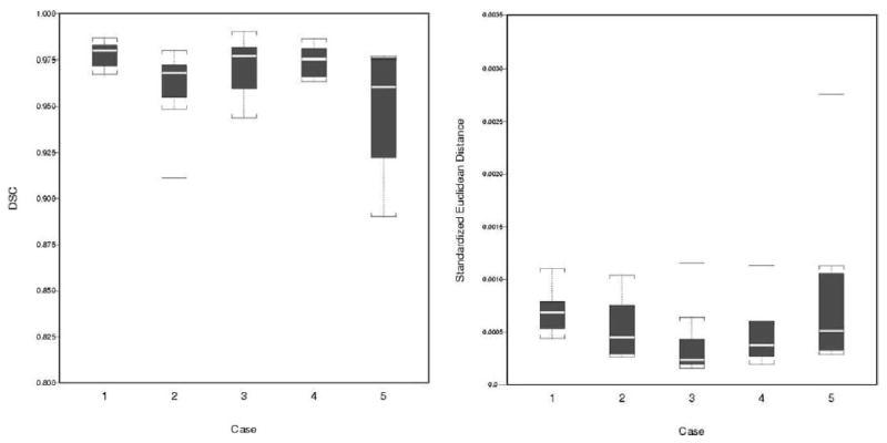
Figure 3.

Box plots of agreement between the SH method and SC: (a) DSC and (b) SED by case. In each box, the center line represents the median for the respective sample. The 25% and 75% ordered percentiles (first and third quartiles) are the bottom and top edges. The difference is the interquartile range (IQR). Outliers are horizontal bars outside the boxes, defined as those beyond 1.5 times IQR from these two quartiles.
