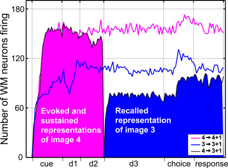
Figure 6. Comparison of Evoked, Sustained, and Recalled Image Representations in Layer WM.
Each line represents the number of active WM neurons at any instant of a particular trial. The pink and blue curves correspond to DMS trials, where images 4 and 3 are used as sample, respectively. These curves illustrate that different neural assemblies represent the sample image when it is perceived by the network, or when this representation is subsequently sustained. For instance, when image 3 is used as sample (blue curve), fewer cells are mobilized by the presentation of the image (cue period) than by its memory sustained during the delay.
The black curve corresponds to the DPA trial where the sample and target are images 4 and 3, respectively. The pink area indicates the amount of WM cells mobilized by the evoked and sustained representations of image 4. The blue area denotes the number of cells making up the representation of image 3 recalled by association. This latter representation, in the case of image 3, clearly mobilizes fewer neurons than either the evoked or sustained representations of that same image.

