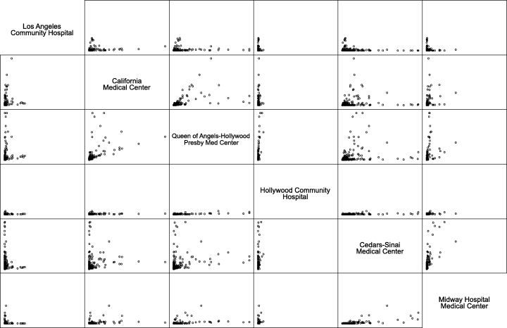
Figure 1.

Patterns of Patient Flow for Six Hospitals in Los Angeles, 1991*
*A dot in this graph represents numbers of patients a zip code area sent to two hospitals on either axis. The maximum for both axes is 2,000 patients, and all axes are in the same scale. Three zip codes that sent more than the maximum are not shown in this graph. Data Source: California OSHPD Patient Discharge Abstracts, 1991.
