
Figure 2.—
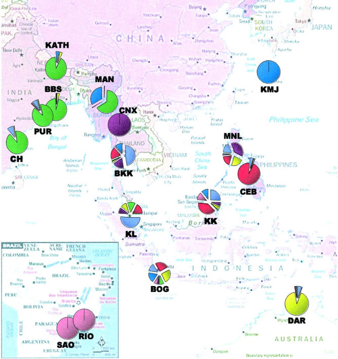
Pie chart of combined genetic ancestries of all individuals sampled in each population, as obtained from Structure (Pritchard et al. 2000). The seven different colors correspond to seven different genetic clusters.
Official websites use .gov
A
.gov website belongs to an official
government organization in the United States.
Secure .gov websites use HTTPS
A lock (
) or https:// means you've safely
connected to the .gov website. Share sensitive
information only on official, secure websites.
Pie chart of combined genetic ancestries of all individuals sampled in each population, as obtained from Structure (Pritchard et al. 2000). The seven different colors correspond to seven different genetic clusters.