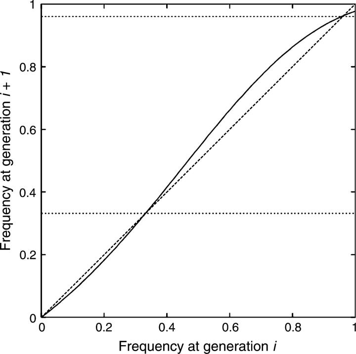
Figure 3.—
The curve is a plot of infection frequency at generation i + 1 as a function of frequency at generation i, for a Wolbachia with the following properties: MI = 0.9, TE = 0.8, FE = 0.96. Any point below the x = y line (dashed) indicates that infection frequency is decreasing; any point above indicates that it is increasing. Horizontal lines indicate the values predicted by the analytical approach for the lowest (unstable) and highest (stable) equilibriums (Hoffmann et al. 1990). As expected, the curve crosses the x = y line precisely forthese values. These results were obtained with a large population (Ne = 106), so that drift has negligible effects.

