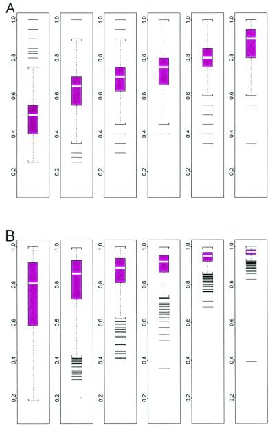
Figure 12.
Boxplots of probe usage (A) and explained energy (B) stratified by presence percentage (the number of presences of a gene in 21 arrays and the subpopulation size for the 6 boxplots are: 0–3, 4,365; 4–7, 817; 8–11, 567; 12–15, 520; 16–19, 518; and 20–21, 342). When presence percentage is high, the excluded probes tend to be cross-hybridizing probes; when presence percentage is low, PM–MM differences fluctuating around 0 may result in many negative probes and exclusion of them. As more arrays enter the database, we may reuse these probes if they respond positively to target expressions. The more arrays in which a target gene is present, the better the explained energy.

