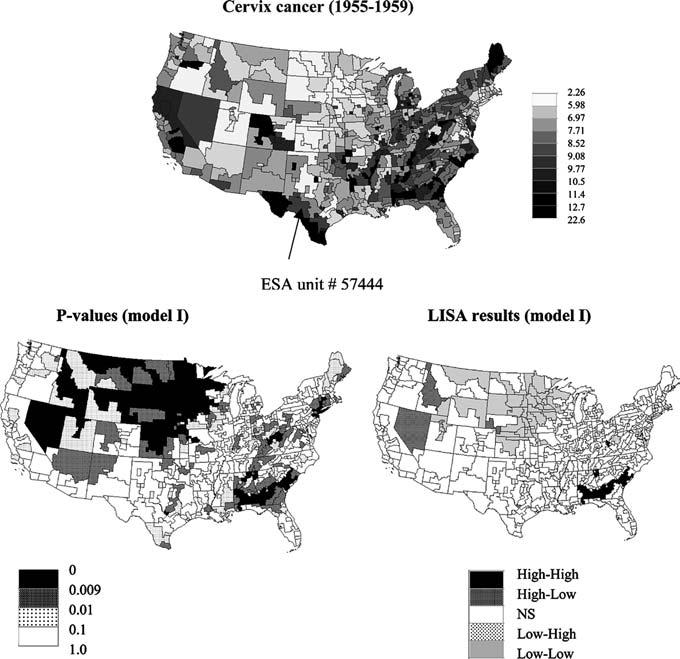
Fig. 1.

Map of cervix cancer mortality (rates per 100,000) for the period 1955–1959 (categories correspond to deciles of the histogram of rates). Bottom graphs show results of local cluster analysis under neutral model I (spatial independence): p-values and the corresponding set of significant outliers and clusters for a 0.009 significance level (Bonferroni adjustment)
