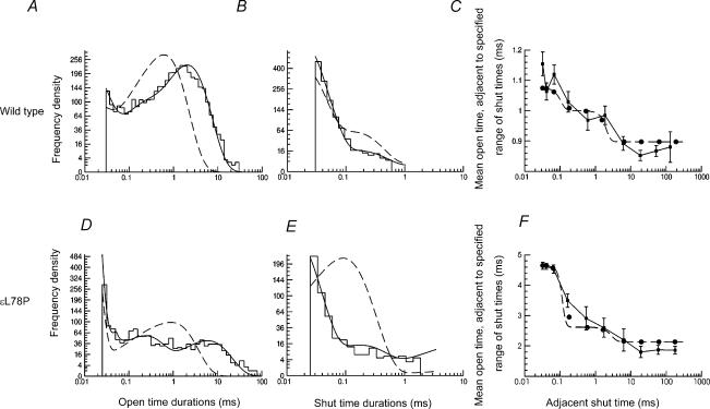
Figure 5. Example of HJC distributions (predicted by fit of Scheme 1) overlaid onto observed open time (A and D) and shut time (B and E) histograms of wild-type and εL78P receptors with 100 nm ACh.
The continuous lines are the HJC distributions calculated from maximum likelihood fitting to the idealized single channel traces. The dashed lines show the distributions of open and shut times that would be predicted if resolution were perfect. The HJC distributions describe the observed open and shut time histograms well. Panels C and F show the conditional mean open time plotted against the adjacent shut time (see Methods). The points with error bars show the experimental observations for each shut time range, the points being joined with continuous straight lines. The circles show the HJC values that are predicted by the fit for the same shut time ranges, and the dashed line shows the continuous theoretical relationship calculated from the HJC distributions.

