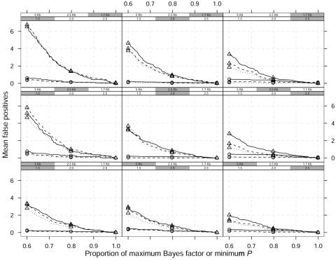
Figure 6. .
Mean false-positive results as a function of proportion of maximum Bayes factor or minimum P value over 100 replicated data sets and a dominant model. Different curves correspond to different window widths around a single causative site used to define a false-positive result: ±60 kb (straight lines), ±30 kb (dashed lines), and ±20 kb (dotted lines). The shaded boxes above each panel identify the different scenarios, which vary in GRR (1.5, 2, and 2.5) and SNP marker density (1 every 5 kb, 2.5 kb, and 1.7 kb). The MAF of the high-risk variant is 0.05. Triangles represent single-locus χ2 analyses; circles represent the Bayesian graphical model.

