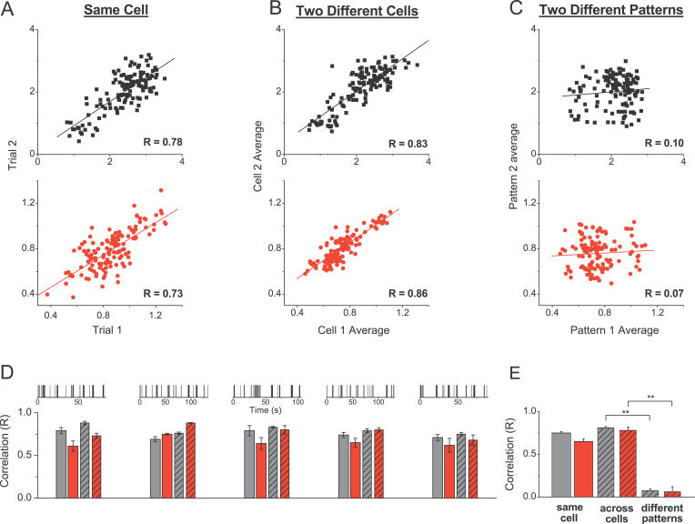
Figure 3. Filtering Patterns of Excitatory and Inhibitory Synapses Are Highly Conserved.
(A) Normalized response amplitudes during two presentations of the same natural spike pattern (as in Figure 1) for one cell are plotted point-by-point against each other; the correlation coefficient is determined with linear regression. Top panel (black) is for EPSCs and bottom panel (red) for IPSCs.
(B and C) Same as (A), but for the average responses from two different cells to the same (B) or to two different (C) stimulation patterns.
(D) Top are representations of five different natural spike trains used. Bar graphs below give average correlation values determined as shown in (A–C) for the five different spike patterns. For each pattern, correlations between two presentations for one cell (two left bars, n = 4–11 cells/pattern) and between average responses from two different cells (two right bars, n = 6–11 random cell pairs/pattern) are plotted for excitatory (black) and inhibitory (red) currents respectively.
(E) Summary of the data from (D).
** indicates p < 10 −6.

