
Figure 7.
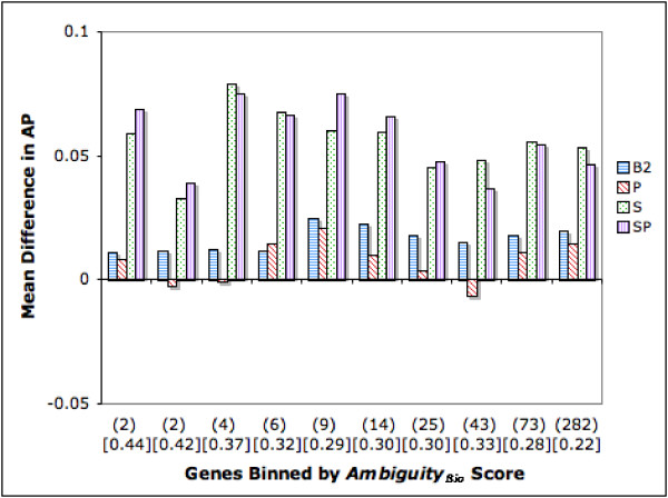
Difference in Average Precision (AP): Genes Binned by AmbiguityBio Score. The figure depicts the relationship between AmbiguityBio score (> 1) and ranking strategy performance in terms of AP. Genes are binned along the X axis by their AmbiguityBio score. All bins except the right most one have 220 genes. The right most bin has 297 genes. Numbers in parenthesis below the X axis show the average AmbiguityBio score for each bin. Mean B1 AP scores for each bin are shown in square brackets in the graph. The Y axis depicts the difference in performance between each strategy and B1. Bars above the X axis denote an improvement whereas bars below the X axis denote a drop in performance.