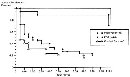
Figure Kaplan-Meier curves according to PEG status. Unadjusted survival curves according to PEG status. The top curve represents the clinically improved group; the middle curve, those who underwent PEG placement; the lower curve, those without PEG placement, comfort care status.
