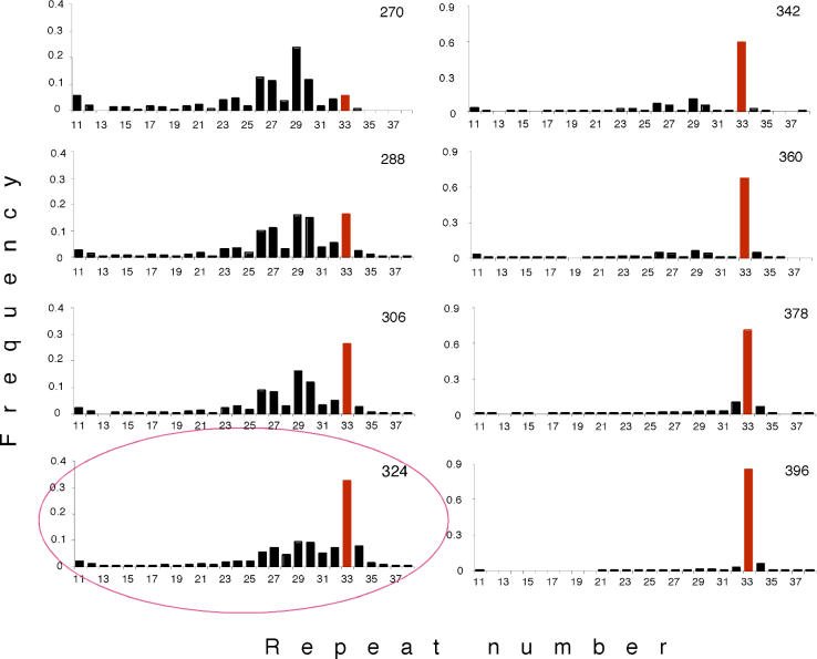
Figure 1. Changes in Allele Frequency at a Microsatellite Marker during the Spread of a Beneficial Mutation.
A “snapshot” of the allele distribution in the evolving E. coli population is shown for every eighteenth generation. The number of generations after the start of the experiment is given on the upper right corner of each graph. Bars represent the frequency of the corresponding microsatellite allele. The microsatellite allele carried by the cell with the beneficial mutation (sweeper) is shown in red. The red ellipse indicates the generation at which we isolated the cells used for the competition experiments. Note that for better resolution the scale of the y-axis has been modified between generations 324 and 342.

