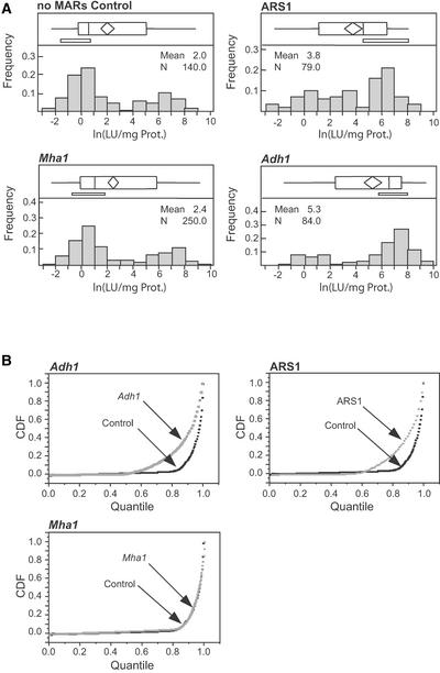
Figure 4.
LUC Expression in BMS Transformants.
(A) Transgene expression level distributions are shown in the histograms. The y axis corresponds to LUC expression on a logarithmic scale [ln(LU/μg protein)], where LU indicates light units. Above each histogram is an outlier box plot. The box represents the interquartile range, or the difference between the 25th and 75th percentiles. The “whiskers” (the horizontal lines outside of the box) represent the range (computed as 150% of the interquartile range). The vertical line inside the box represents the median, and the diamond represents the mean. The bracket underneath the box identifies the most dense 50% of all observations. All distributions were bimodal, and the shape of the distributions is similar for no-MARs and Mha1, indicating that Mha1 had no effect on expression. ARS1 and Adh1 both increased the expression level and shifted the majority of expressing events to the higher expressing peak of the bimodal distribution.
(B) Cumulative distribution function (CDF) graphs. Adh1 5′ MAR and ARS1 both have distributions significantly different from that of the no-MAR control. Mha1 5′ MAR has the same distribution as the no-MAR control.

