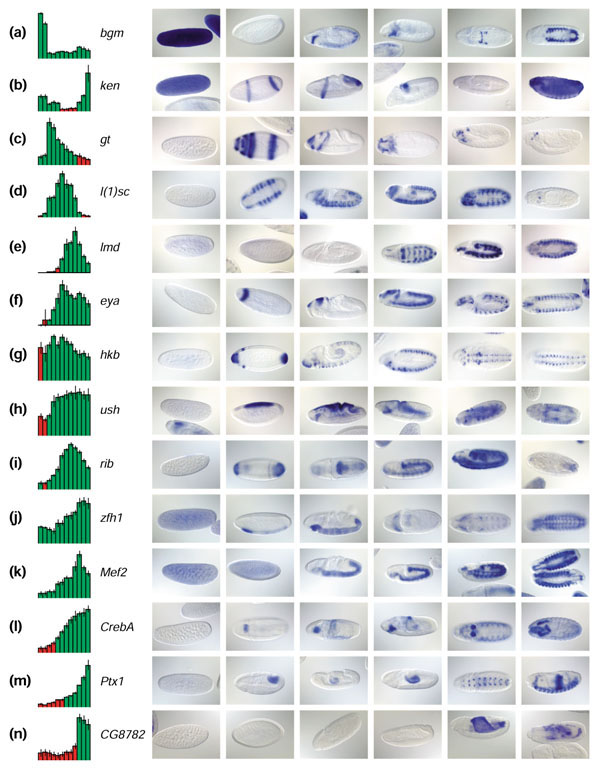
Figure 5.

Correlation of image and microarray data. (a-n) Fourteen examples of correlations between microarray and image data for genes with known expression patterns. Microarray expression profiles are shown on the left. Red is absent, green is present, and vertical lines on bars represent error bars of triplicate measurements. On the right are six representative images, one for each stage range specified in Figure 4, ordered according to developmental time to allow visual correlation with the corresponding array profile. Anterior to the left. The most straightforward comparisons occur when gene expression comes on (e,n) or is turned off abruptly (a,b), corresponding to the absence or presence of in situ staining respectively. In many cases, the absent/present call misses the expression of genes confined to a small subset of tissues (c,m). (l) Gene-expression levels increase, followed by an increase in staining intensity that occupies approximately the same proportion of the embryo. (f) The increase in microarray intensity reflects an increase in the number of cells in the embryo showing gene expression across time. (c) Fading expression is indicative of the restriction of gene expression to a smaller subset of cells as development proceeds. Frequently, a microarray profile will show both types of fluctuations, and in that case the visual correlation is rather subjective (g,h), unless accompanied by a clear-cut qualitative change (d,e,i). (k) Genes transcribed both maternally and zygotically have no 'off' period during our developmental time course. (j) The decrease in abundance of maternal transcript often overlaps with emergence of zygotic transcript, leading to the flattening of the early portion of the microarray profile.
