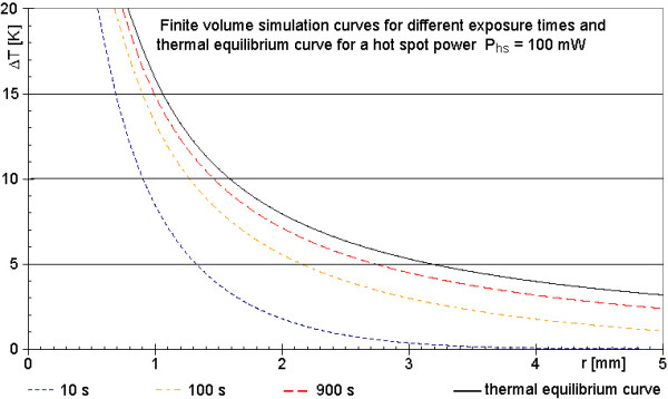
Figure 7.

Calculated temperature increases around a spherical power source of Phs = 100 mW after different simulated times. The four graphs of the calculation (25 μm in r-direction, 125 μm in x-direction, temporal resolution 200 μs) approach the theoretical curve (black line) of final temperature increases according to thermal equilibrium, as expected. This is one indication of a correctly implemented algorithm. All curves refer to a power loss of 100 mW. The black line of figure 7 and the 100 mW line of figure 4 are differently scaled presentations of the same case.
